Key Takeaways
- Good design is inclusive: Color choices that work for you can fail for a sizeable group of users. About 1 in 12 men have some form of color vision deficiency.
- Consider accessibility up front: I only noticed the problem because I'm color blind myself, and even then I spent 20 minutes debugging before I realized my color blindness had played a trick on me. Going forward, we'll ask ourselves about accessibility with every new UI feature.
- Try the new Color blindness mode: The September 2026 release of Tabular Editor 3 lets you change the green background of added objects to teal.
This summary is produced by the author, and not by AI.
Change indicators in the TOM Explorer
I was working on a feature in Tabular Editor 3 recently to allow users to easily distinguish objects in the TOM Explorer that have been changed since the last save. This has been a feature many of our customers have asked for for a long time, and I’m happy that it finally made it into 3.27.0.
While brainstorming the feature, we quickly realized we should reuse the same pattern for indicating the different types of changes we use in the Model Diff View. That is, an orange background color for modified objects, green for added objects, red for deleted objects. Pretty standard stuff, right?
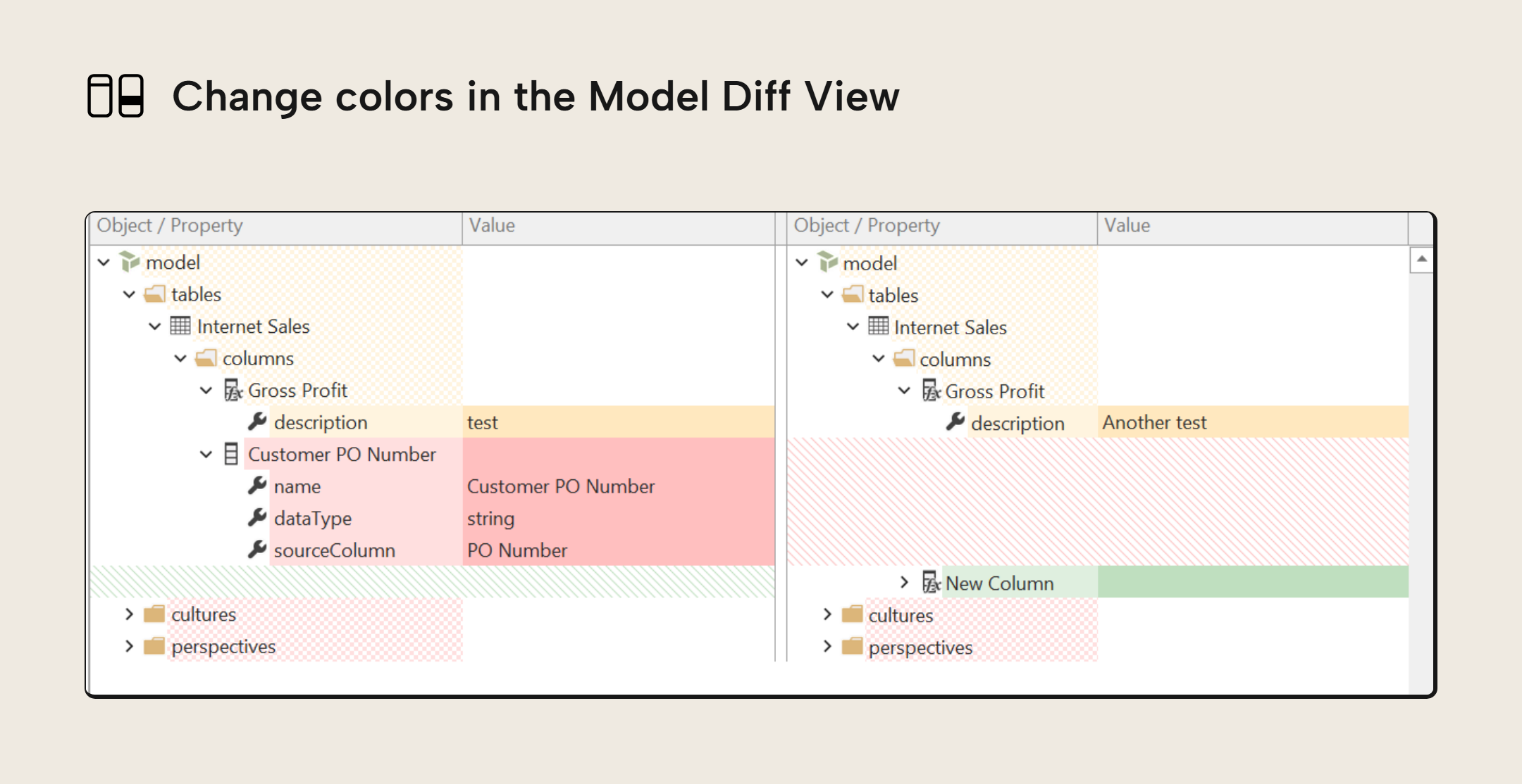
Red and green in the same pane
Well, when I applied the same pattern of colors to the new change indicators in the TOM Explorer, I had a bit of a surprise:
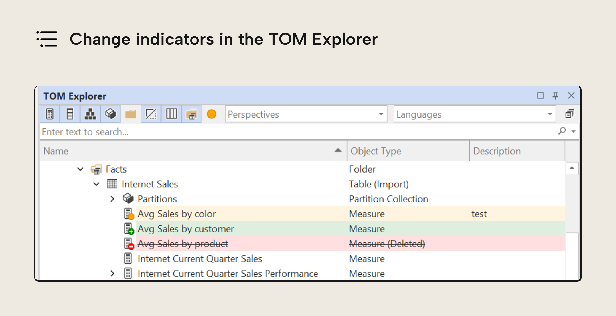
Most readers of this article won’t notice the issue, but people with deuteranopia (red-green color blindness) can’t easily distinguish the background colors that indicate addition and deletion. In fact, for me, the colors look so similar that I thought there was a bug in the code styling the elements of the TOM Explorer. I spent 20 minutes debugging before realizing that my color blindness had played a trick on me. I never noticed this problem in the Model Diff View because the red hues are always shown on the left pane, while the green hues are always on the right. So even though I also can’t distinguish the red and green colors in that dialog, it is much less of an issue because of the context (left side = before, right side = after).
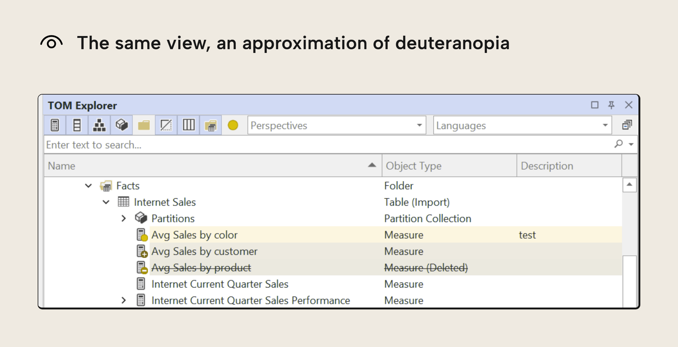
In the TOM Explorer, however, all changes are shown in the same pane of glass, and so other than the background color, we can only use a few smaller visual cues like the plus/minus badge on the icon, and the struck out text of deleted items, to distinguish “added” from “deleted”. As such, having background colors that are easy to distinguish when quickly glancing over the TOM Explorer becomes much more important.
NOTE
The second TOM Explorer screenshot simulates deuteranopia with the model by Machado, Oliveira, and Fernandes (2009). A simulation can only approximate the effect, because color vision differs from person to person.
Color blindness mode in the September release
While working to improve this, I realized we need to do better on accessibility. The September release includes a “Color blindness mode” option that changes the default “green” background color to a more accessible alternative for people with various forms of color blindness.
Further Reading
- Unsaved change indicators (Tabular Editor). Documents the change indicators in the TOM Explorer and the Properties pane, including how to revert and restore changes and where to turn on Color blindness mode.
- Color blindness (National Eye Institute). Explains the types and causes of color vision deficiency, and how common it is: about 1 in 12 men have it.
- Design Power BI reports for accessibility (Microsoft Learn). The same problem applies to your own reports: this guide lists color combinations that are hard to tell apart, starting with green and red.
- Data visualization best practices for Power BI reports (Tabular Editor). Covers the principles of good report design, including how to use color intentionally to direct attention to what matters.
Conclusion
As a WinForms app, Tabular Editor 3 already integrates well with Windows UI Automation, enabling the use of screen readers and other assistive technologies. However, there may well be other areas where we need to consider good accessibility practices up front, when designing new features, as this example demonstrates. Going forward, we’ll ask ourselves this question with every new UI feature we ship.
We also kindly invite all Tabular Editor 3 users to reach out if they encounter any other accessibility issues with existing product features.
Take your semantic models further with Tabular Editor.
Give Tabular Editor a spin