Key takeaways
- Power BI reports are tightly coupled with semantic models today, and this is a problem: A Power BI report is dependent on the model for reporting functionality and how data displays. It’s very common to have to create structures and calculations just to get the data to display in a specific way (such as sparklines in cards or labelling the latest data point in a chart). The consequence of this are semantic models (and reports) become complex to build and maintain.
- Data apps are a separate visual layer in Fabric that sits on top of semantic models: With data apps, all of the visual functionality and appearance comes from its code, for better or worse. It doesn’t require field parameters, complex DAX, or SVGs workarounds, and it’s easier and faster to make a data app using a coding agent than a Power BI report.
- Data apps strengthen the strategic position of semantic models in Microsoft Fabric: Semantic models don’t have to contain structures and calculations that exist only to support Power BI report requirements or overcome report limitations. The consequences are that if you use data apps for your visual layer, semantic models can become simpler, and therefore easier (and cheaper) to build and maintain, and will work better with conversational BI with tools like data agents.
The value of data apps in Fabric
Fabric data apps are the most interesting thing to happen to data visualization in Power BI and Microsoft Fabric, ever. They provide limitless potential for how to visualize and interact with your data. However, they also indirectly provide a major benefit to your semantic models by allowing them to be simpler to build, use, and maintain.
In this article, we argue that data apps provide a reporting layer that is separate from the semantic layer, something that wasn’t true in Power BI due to tight coupling between reports and semantic models.
NOTE
Data apps don’t replace Power BI reports. We discuss some of the limitations and caveats of data apps in our previous article, but in summary the key ones are a dependance upon AI, higher complexity, and having to recreate from scratch a lot of functionality that comes out-of-the-box in Power BI, from export to Excel to drillthrough and email subscriptions.
That said, data apps provide many advantages over Power BI reports, too, including a higher fidelity visualization experience that works better and faster with agentic development tools. You can use data apps as the primary method to display and consume data from Fabric over Power BI reports.
Power BI reports and semantic models are tightly coupled
In Power BI, reports are dependent on the semantic model not just for data but also functionality. If you want to display data in a certain way, or get a certain functionality, then much of the time you need to make changes in your model specifically to support that requirement. Usually, these changes are not even usable by other downstream artifacts, like Excel pivot tables, notebooks, or data agents. This is not a rare or esoteric phenomenon; in our experience, a typical model can have ~20 to 40% of its objects and ~50 to 75% of the DAX to serve the report and not business semantics.
Consider the following example of (part of) a report, which contains over a dozen report-specific model objects (many of which are deep dependencies) just to create the charts shown in the screenshot:
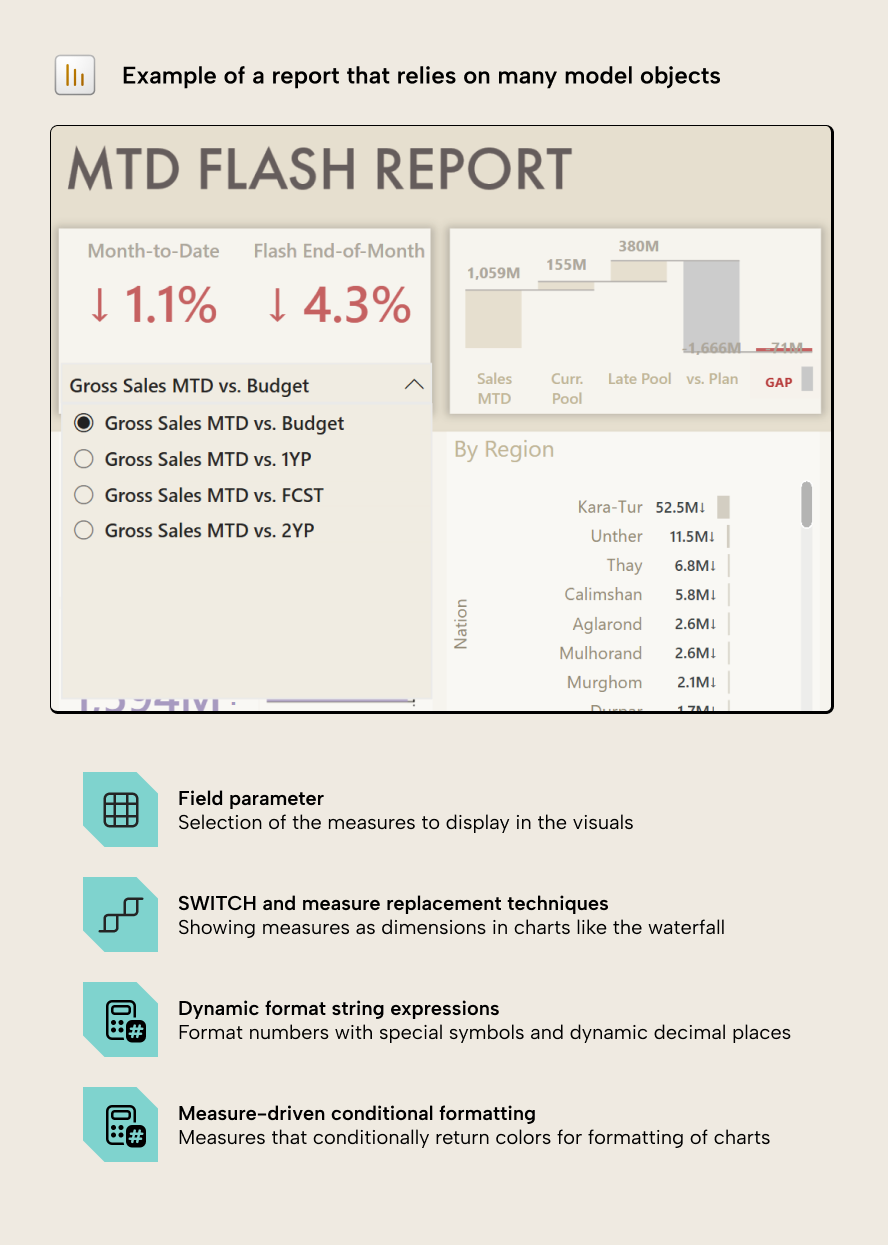
These types of report-specific model objects include:
- Field parameters, SWITCH measures or calculation-group measure replacement for dynamic selection of fields in a report and visual workarounds.
- Conditional rendering of data points, like a measure that returns a value to label only the latest or earliest point on a line or bar chart.
- Conditional-formatting measures that return hex color codes (like #000000) or semantic colors from the theme (such as “good” or “bad”).
- Dynamic format string expressions or custom format strings that are necessary to display the numbers in the correct format.
- General DAX tricks to fit a particular visual design or work around a limitation, of which SVG-generating measures are the worst (and possibly the most common) offenders.
Note that the presence of these objects in a model isn’t really a bad practice; in fact, it’s often necessary to make a good report or fulfill business requirements. This is because Power BI reports work well for simple scenarios but are notoriously limited and inflexible for bespoke or complex visual requirements, where a custom visual would be overkill or suboptimal. However, this does result in consequences for semantic model and the people who maintain it.
Report functionality is expensive for a semantic model; it doesn’t belong there
When semantic models contain these report objects it results in real consequences and cost:
- It adds complexity to the semantic model, making it more difficult to maintain or change. Changes often break downstream reports in unexpected ways or create situations where it’s difficult to understand what a pattern or calculation in the model is doing or why it’s there.
- The semantic model design might be constrained by reporting requirements. This is common when a different person makes the model as the reports, and leads to situations where the report developer doesn’t have what they need and can’t make a good report.
- Report authors who make the semantic model must learn DAX and modeling concepts to make the reports, which is often not their primary responsibility or interest; it just beceomes an obstacle to them creating compelling and effective visualizations.
- The model does not work as well with AI, both with agentic development and conversational BI interfaces like data agents. This is because the report objects create noise that confuses the agent and makes it harder to “understand” the model without high-effort steps to prepare data for AI.
Could reports just carry this themselves? Only partly: report-level measures can keep some display and calculation logic out of the model but they don’t reuse across reports. Further, they can’t cover in-memory tabular objects like field parameters or calculation groups, so it ends up back in the model, anyway.
So, in summary, to make a good report, you often have to make concessions in your semantic model, which has costs and problems that we’ve been dealing with for a decade, now. However, we think this changes with data apps in Fabric.
Data apps are a visual layer with a separate concern
Power BI reports and data apps both query the semantic model in DAX; however, the similarities end there. In a data app, all of the functionality comes from code, which means that as long as you can express a functionality or display, it will work. This means that everything from formatting to filtering is owned by the data app; there’s a complete, hard sparation with semantic models, and only the data – not the visualization functionality – depends on the semantic model.
This is somewhat a double-edged sword, since you have more flexibility and the separation from the model, but you also don’t get a lot of functionality that comes out-of-the-box with Power BI. Regardless, it’s honestly quite trivial to build this with a coding agent for a simple dashboard. If you need something more sophisticated or complex, it can take time.
The separation between visualization and semantic layers help depict a clear separation between your data layers in Microsoft Fabric:
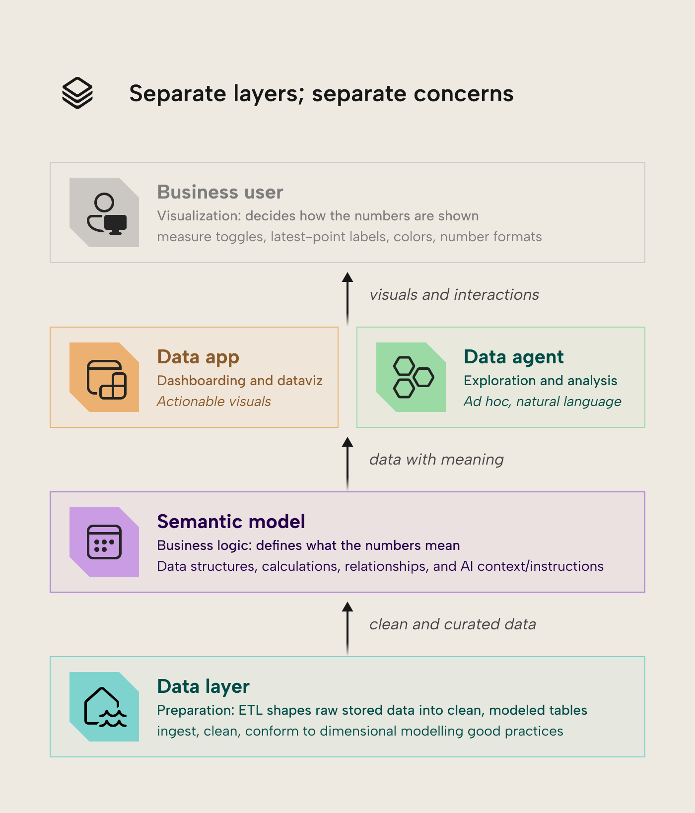
In summary, the business logic (what Revenue, Margin, MTD targets etc mean) stays in the model; the presentation logic (which measure is toggled, colors, labels, the latest-point marker) is in the data app. Of course, it’s still possible to have reporting logic in DAX, or calculations in the app (in TypeScript), but it’s no longer necessary. This means that the semantic model can focus on what it does best.
When you have this clear separation, model developers can focus on making a good semantic model without arbitrary concessions for Power BI, agnostic of whatever consumes it. This applies not only to the model structure but also the DAX, as (in our experience) a lot of the complicated DAX in semantic models that have issues with performance or accuracy aren’t necessarily to support business logic, but to get the data to display a certain way in a visual. The hypothesis here is that having the separation between model and report can produce a simpler, smaller model that’s easier to build, use and manage.
WARNING
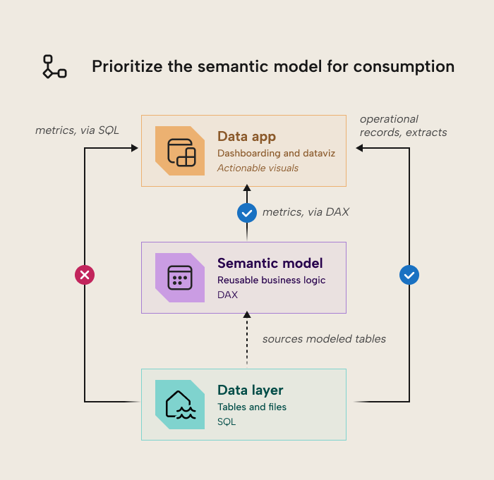
A data app made with Rayfin can technically connect to lakehouses, warehouses, and SQL databases in addition to semantic models. However, you should always prioritize the semantic model as the first-class citizen for consumption and reporting. Bypassing the semantic model will likely mean reproducing business logic in SQL queries of the data app, rather than centralizing them in your semantic layer.
What this means for Fabric and Power BI teams
In centralized BI scenarios where golden models and dashboards are distributed to a large population of end-users, data apps are quite appealing. You get both better dashboards and tighter, simpler semantic models, that are easier to re-use for self-service BI or AI scenarios. Even for decentralized scenarios where business analytics teams produce models and data, using data apps together with coding agents could help them move faster and overcome reporting limitations due to DAX or semantic modelling. This opportunity to simplify and streamline semantic models is a welcome one, especially in an age where AI is continuously generating more entropy, noise, and data.
That said, it’s a tradeoff for simplicity in the semantic model but complexity in the visualization layer. It’s something that likely only produces a clear benefit for teams that are leaning into agentic- and code-first workflows, or who have mature data visualization needs and capabilities that Power BI reports simply can’t meet. It’s also worth honestly evaluating whether data apps might be favorable over Power BI reports for new projects, including their limitations and effective reliance upon a coding agent to do the work.
Further Reading
- Fabric Apps explained: visualization as code in a data app dashboard. The companion piece on what data apps are and how to build them; this article is the model-side counterpart.
- Fabric Apps documentation. Microsoft’s documentation for Fabric Apps.
- Rayfin CLI reference. Microsoft’s reference material for the Rayfin CLI.
In conclusion
Data apps are a big deal for semantic modeling, not just visualization: by taking the report’s display work off the model’s plate, they let the model get smaller, clearer, and easier for people and agents alike. Keep the split clean and the model the first-class citizen every consumer queries, and you get a leaner model and a more flexible front-end at the same time.