
Key takeaways
- Report formatting is slow and limited: Many options aren't available in the UI, and bespoke visual formatting takes a lot of time.
- Report metadata unlocks more: With the PBIR format you can edit report metadata to create visuals that aren't possible through the UI.
- These patterns suit AI, not humans: Metadata-driven patterns are impractical to hand-edit, but coding agents like Claude Code can apply them from natural language.
- Agentic report development is complex: Agents must juggle the model, theme, DAX, rendering engine, and metadata, so it's fragile; custom visuals (R, Python, Deneb) are often easier.
This summary is produced by the author, and not by AI.
Conditionally formatting lines in a Power BI line chart
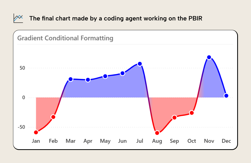
The core visuals of Power BI reports continue to improve every month. However, there are still many properties and formatting options which are unavailable. An example is the conditional formatting of a line in a line chart, like in the following demonstration:
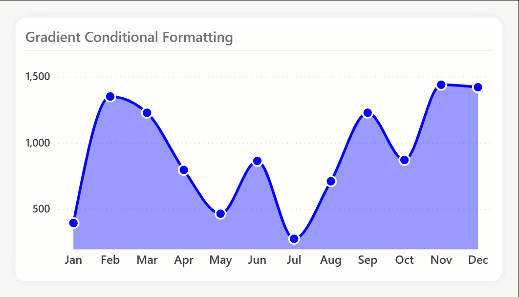
As you can see, the line, area, and markers change colors depending on whether they are above or below zero. We’ll explain how to create this chart in Power BI later in this article.
Previously, this design was only possible with various workarounds or custom visuals. These workarounds often involve complex manipulation of the visual configuration, bending the visuals to behave in ways that are unintuitive and difficult to maintain. They also typically involve DAX patterns or multiple measures that can lead to performance woes. Indeed, many of the “slow reports” one encounters in the wild are not due to bad DAX or models themselves, but more because people are trying to get Power BI visuals to behave a certain way; to show the data the way they want to. This isn’t ideal, but some recent discoveries have made things even more interesting.
Recently, Marcus Wegener, Rahat Qayyum and others demonstrated a curious technique, whereby you could manipulate Power BI report metadata to achieve conditional formatting of certain properties and visuals that the Power BI user interface doesn’t support. Yet, the visual will still render and behave normally. This isn’t exclusive to colors and titles, but also other properties like chart layouts. While interesting, this is also problematic:
- It’s easy to make a mistake and “break” the visual or get a result that doesn’t render.
- To make changes you must read and modify the JSON; you can’t use the UI.
- This isn’t documented and works in some scenarios or
visualTypes, but not others.
In this article, we’ll demonstrate and extend this scenario and explain how you can use it to create the visual demonstrated above. Further, we’ll discuss what this means in the context of agentic report development; when a coding agent modifies the PBIR metadata directly to help report authors save time and format reports.
WARNING
We do not recommend using this technique for reports that you deploy to production. This article is demonstrating a peculiar and interesting behavior of the PBIR metadata, and the capabilities (and challenges) of coding agents to facilitate agentic report development. If you need formatting options that are not within reach of the Power BI Desktop user interface, we advise that you use Power BI custom visuals, such as those in AppSource, or Deneb, Python, or R visuals.
Using Claude Code to manage your report metadata can be useful. However, you should be aware that report metadata can contain data points from your semantic model, and in certain scenarios, data points from other semantic models that the report was previously bound to.
The scenario: conditionally format a line in a line chart
In this scenario, we want to conditionally format the line, area, and markers of a line chart:
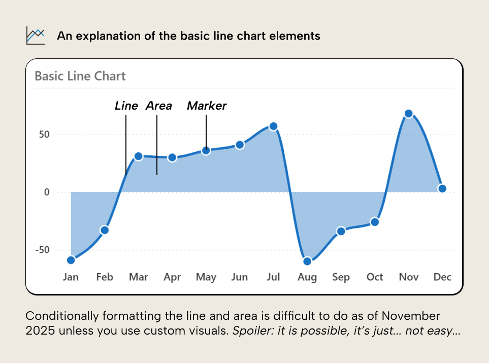
The goal is to produce the chart we demonstrated previously, where these chart elements are conditionally formatted depending on whether they are above or below the zero line
In this scenario, we will make the chart by using the Power BI core visuals, alone.
Conditionally formatting a line with the user interface
In the line or area chart of Power BI, we can easily create the basic chart. The problem, however, lies in the conditional formatting. As of October 2025, there’s no support for conditionally formatting lines. We could manually set the formatting for each month to achieve the desired, result, but this isn't dynamic.
There are workarounds to conditionally format the line markers. Specifically, you can set conditional formatting in a bar chart, then switching to a line chart, which produces the following result:
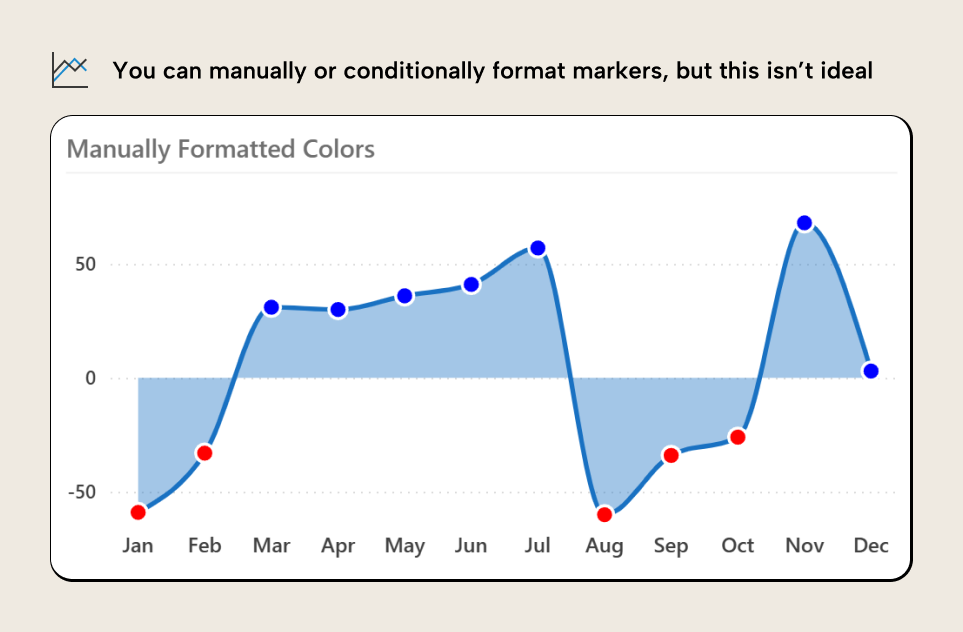
This obviously isn’t what we want. We want to format the line and not just its markers. Adding markers often tends to make line charts less effective because it takes the focus away from the slope and trend, and places it more on the discrete points; if the markers are important, you might as well just use the bar chart, honestly.
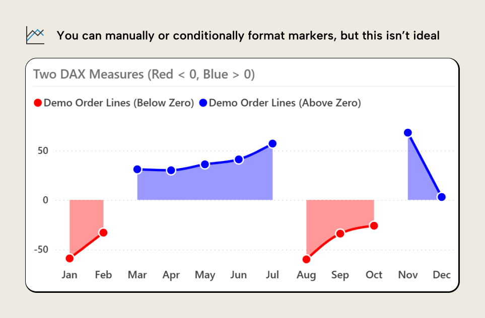
To continue this journey, however, there are also workarounds where you use two measures which are distinct series assigned their own color. You can conditionally hide them using DAX. Each of the below measures become their own series:
Demo Order Lines (Above Zero) :=
VAR _Value = [Demo Order Lines]
RETURN
    IF(_Value >= 0, _Value, BLANK())
Demo Order Lines (Above Zero) :=
VAR _Value = [Demo Order Lines]
RETURN
    IF(_Value < 0, _Value, BLANK())
Still, the result is clearly not ideal:
We can push this further with additional workarounds: error bar shading, SVGs, and so forth. Things get even more complex when you want to format the line relative to another series, as Daniel Marsh-Patrick explains very well in this article. So now we flip the table, throw our laptop out the window, and go home, right?
Conditionally formatting the line
As we spoiled at the beginning of this article, it’s possible to get the result if we modify the visual metadata in a very specific way:
To get this result we must make the following metadata changes:
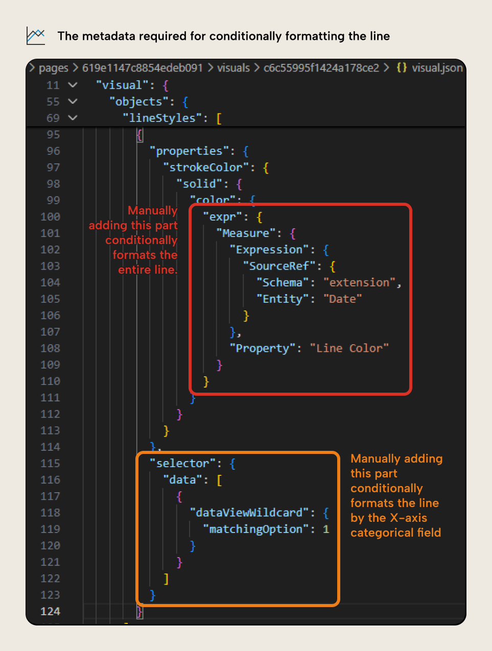
The first change (in red) replaces a “Literal” value with the “Measure” reference, making it dynamic. The measure defines conditional formatting, as described in this article. This is what others in the Power BI community have described previously; it allows you to dynamically control many (but not all) properties in the visual. This is fairly obvious to understand.
However, the second property change (in orange) is less obvious. Reading it, you’d likely not understand it unless you have developed custom visuals before or you are intimately familiar with the Power BI report metadata. In short, this property makes it so that the filter context of the conditional formatting is applied not by line series but by line part, where “part” is the X-axis categories (month, in this case).
So, how did we figure this out? Well, we didn’t. Claude Code did.
Agentic development of Power BI reports
To get this result, we provided Claude Code the requirements and several examples of line charts and other visuals with conditional formatting. Then, we gave Claude Code free reign over the metadata and (using the Fabric CLI) the ability to publish reports, then (with the Playwright MCP server) “view” them. The coding agent continued in iterative loops under human supervision, until it produced the desired result (after many, many iterations).
This is an example of agentic report development, where the coding agent directly modifies the report metadata. This is similar to agents who modify TMDL files. However, it is much, much more complex, for reasons like the following:
- The report metadata files are JSON which are heavily nested and hard to understand.
- The metadata files contain references to fields, tables, and data points, so the agent must be aware of both the semantic model and the report.
- The metadata references the report theme, which can be a very large JSON file that the agent will struggle to work with and understand.
- There are many inconsistencies in the metadata which causes agents to become confused.
- Agents must understand DAX, including model measures, thin report measures, and visual calculations.
- Agents must also occasionally work with other languages, like Python, R, and Vega or Vega-Lite (for Deneb).
- Many properties in the metadata do not align with their nomenclature in the user interface of Power BI, and they are often used in ways that aren’t intuitive (like error bars used as target lines for bar charts).
In short, coding agents are much more likely to make mistakes when they work with report metadata than when they work with semantic model metadata. While they can help with making simple changes or finding patterns, they struggle with anything bespoke or complex.
Here’s where coding agents do work well with report metadata:
- Making bulk changes (like titles, visual size, color changes, etc.) with good instructions.
- Manipulating files (copying, removing, moving)
- Templating reports (taking an example of a visual and inserting it into your report with the correct fields and formatting based on your instructions).
- Working with custom visuals.
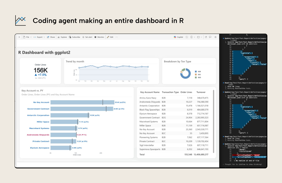
The last example is perhaps the most interesting. You can easily get a coding agent to make entire reports and dashboards from Python or R, alone, like the following example:
However, the reality is that report metadata is complex and nuanced, and agentic development – while possible – demands more effort from a human orchestrator. We’ve been investigating this in detail with others in the community, and exploring tools to make this easier.
In summary, there is a clear opportunity for coding agents to not only help you save time but also do more than what the user interface permits. For now, this is dangerous and fragile. In the future, this will unlock more possibilities of the reporting layer in Power BI.
For further reading
- C# scripting PBIR (Tabular Editor Blog). Covers how to read and modify PBIR report metadata using C# scripts in Tabular Editor, complementing the direct JSON editing approach shown here.
- Visual Studio Code and extensions for Power BI developers in simple terms (Tabular Editor Blog). Explains the VS Code workflow for Power BI projects, including extensions and settings that make editing PBIR metadata more productive.
- Power BI projects report (Microsoft Learn). Microsoft's reference for the PBIR folder structure explains each metadata file and field that you can inspect and modify.
- Re-using visual formatting in and across Power BI reports (SQLBI). Shows how reusable visual formatting works in report metadata, which is central to the conditional formatting technique discussed here.
In conclusion
Formatting and managing Power BI reports takes a lot of time, and can be a frustrating exercise in playing hide-and-seek with formatting pane menus. There’s many options that aren’t available, or that aren’t obvious in the UI. You can modify the Power BI report metadata directly if it’s in the PBIR format, either manually or with scripting, which can produce novel and interesting results. However, this gets much more interesting with coding agents, who can even find new patterns. In practice, though, this is still a fragile and difficult process; agentic report development demands more of an agent than semantic model development does.
Still, the right orchestration can yield interesting results, especially with custom visuals.
Take your semantic models further with Tabular Editor.
Give Tabular Editor a spin